an award-winning firm
Awards & Accolades
celebrating a few of our awards
Showcasing Our Home Transformation Recognition
Client Collaboration. Design Innovation. Detailed Planning. Skilled Craftsmanship. Quality Control. Client Satisfaction.
Here are a few awards for our remodeling work in the Bellevue, Redmond, Sammamish, and Woodinville areas:
Women in Residential Construction Conference
Hosted by nationwide organizations ProBuilder, ProRemodeler, and Building Design + Construction, speakers across the country are vetted to speak at this 3-day event in Nashville, TN
425 Magazine
After winning the Best Overall Kitchen Award at the National Kitchen and Bath Association’s design competition for the Puget Sound Chapter, our award-winning designer, Allison, dished out some great 2023 trends.

ProRemodeler Podcast Guest
After winning the Best Overall Kitchen Award at the National Kitchen and Bath Association’s design competition for the Puget Sound Chapter, our award-winning designer, Allison, dished out some great 2023 trends.
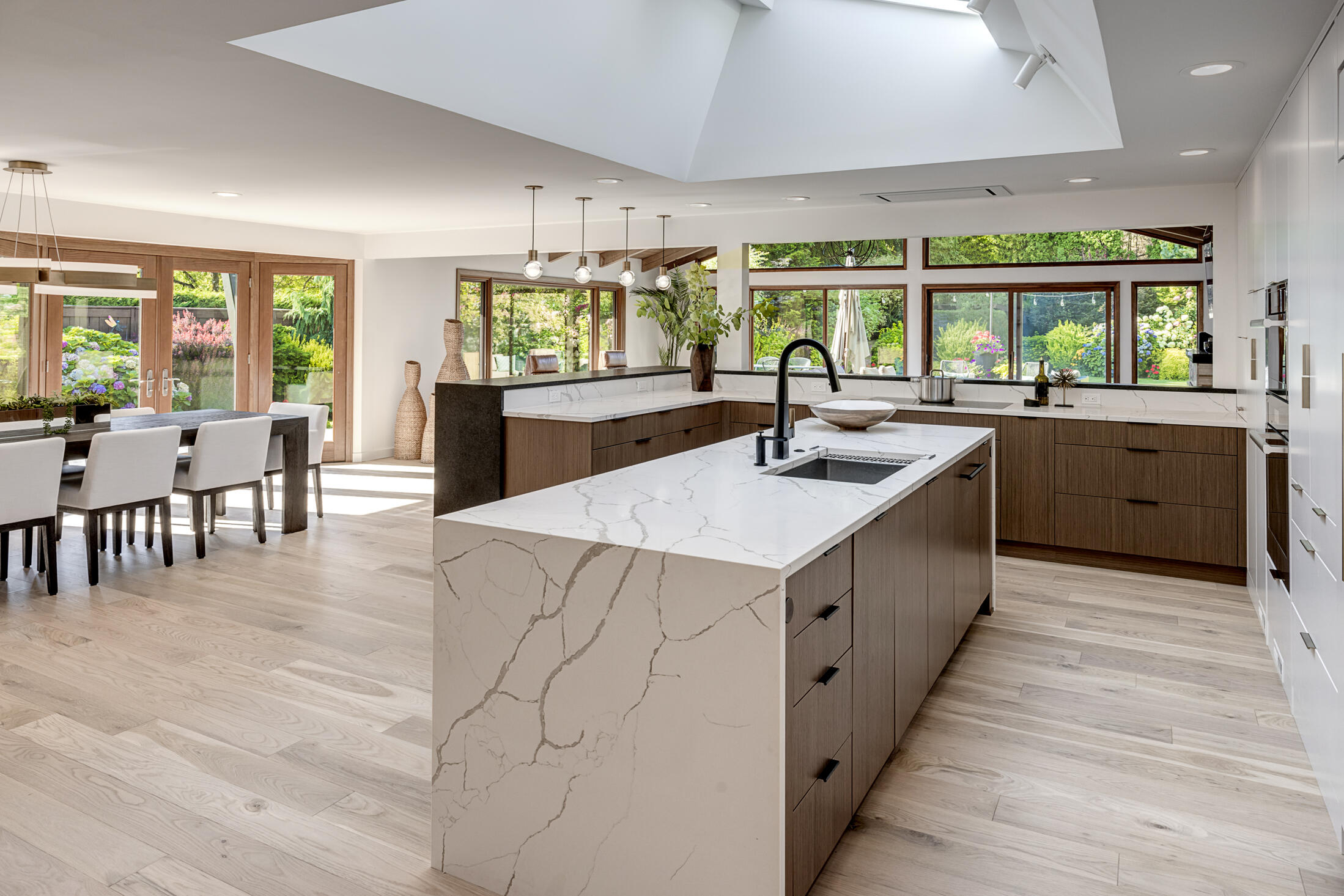
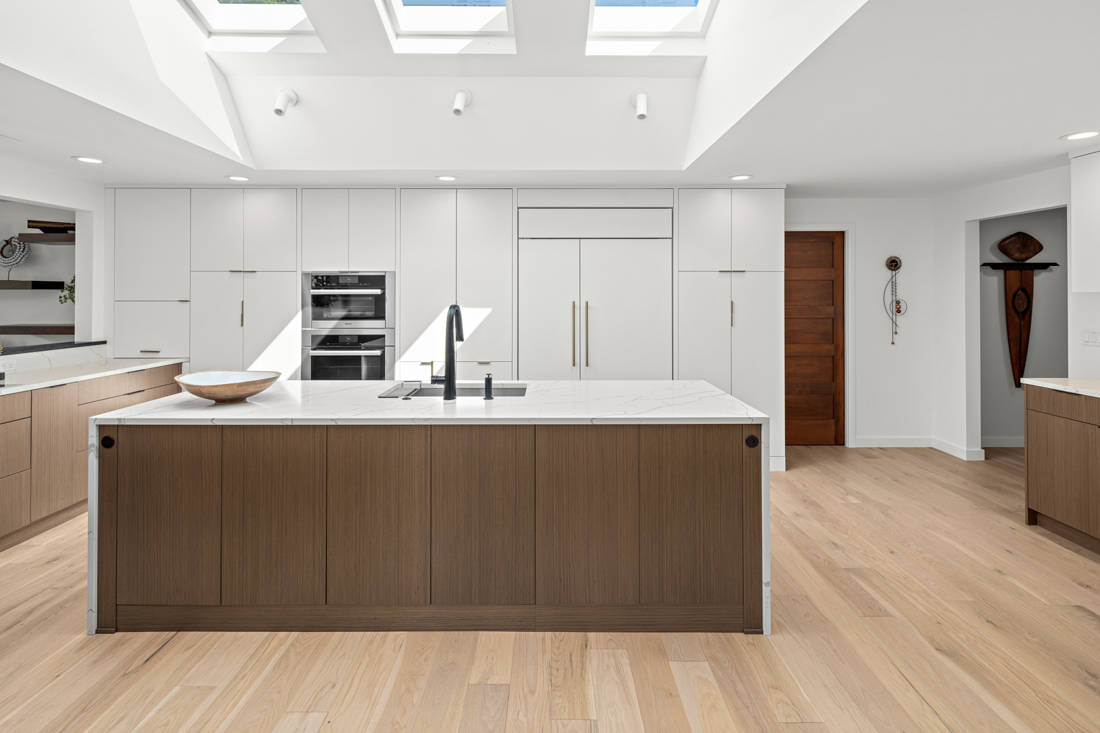
Mid Century Ranch with California Vibe
- 2023 Chrysalis Regional Award - Residential Interiors
- 2023 NKBA Best Overall Kitchen
- 2023 Master Builder Association - Large Bath
…
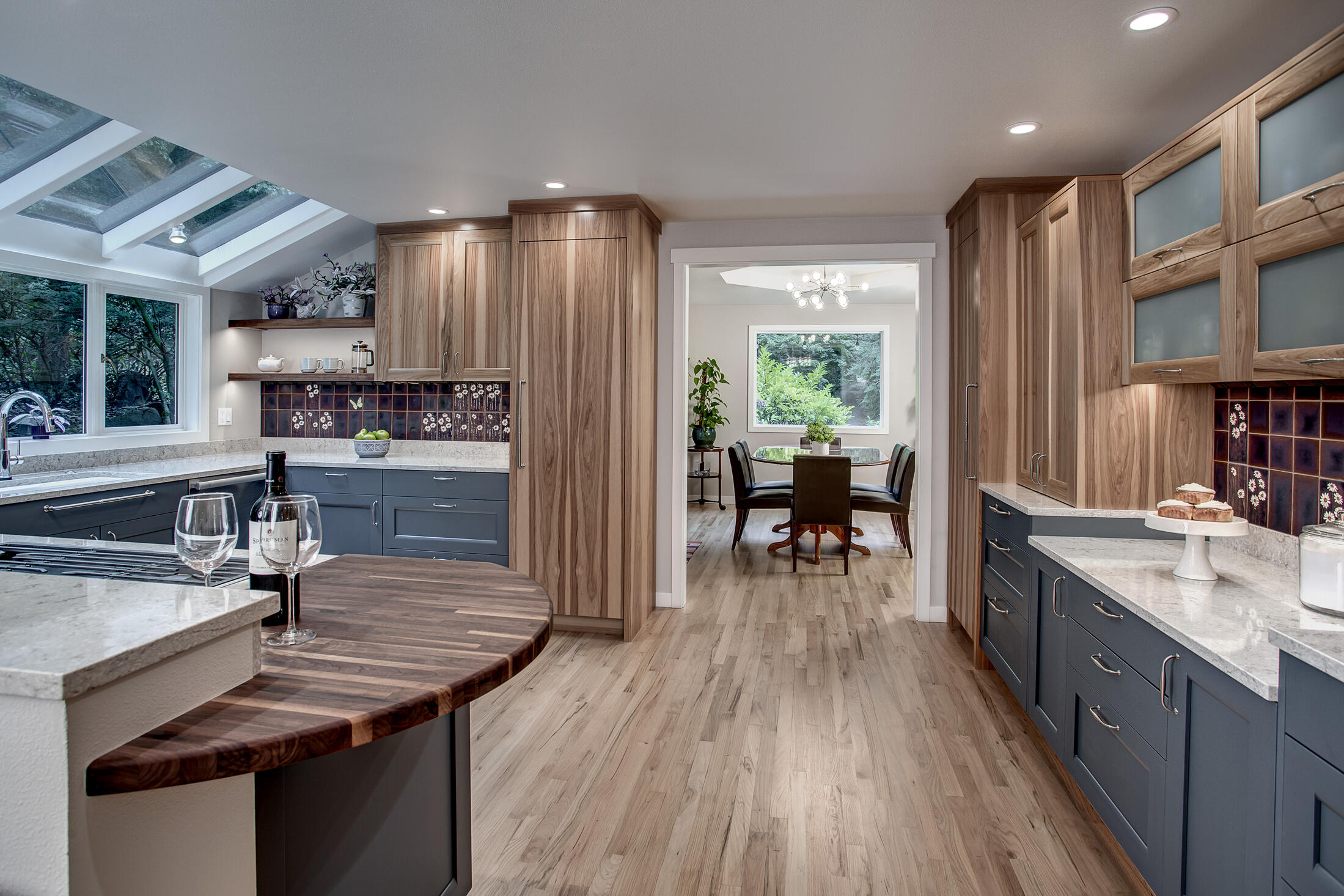
Whimsical Cozy Kitchen
- 2022 REX Award Winner – Kitchen Excellence
- Awarded by the Master Builders Association of King and Snohomish Counties
These Cottage Lake homeowners contacted us to help them refresh their dark, dated Woodinville kitchen with personal design touches, improved lighting, and better flow. Their new space includes custom-designed tile, delicately accented with whimsical daisies and butterflies, stunning hickory cabinets, and one-of-a-kind lighting fixtures that leave the kitchen bright and beautiful. The reworked floorplan also had room for a baker’s haven complete with a pantry cabinet, dropped counter, and stand mixer storage.
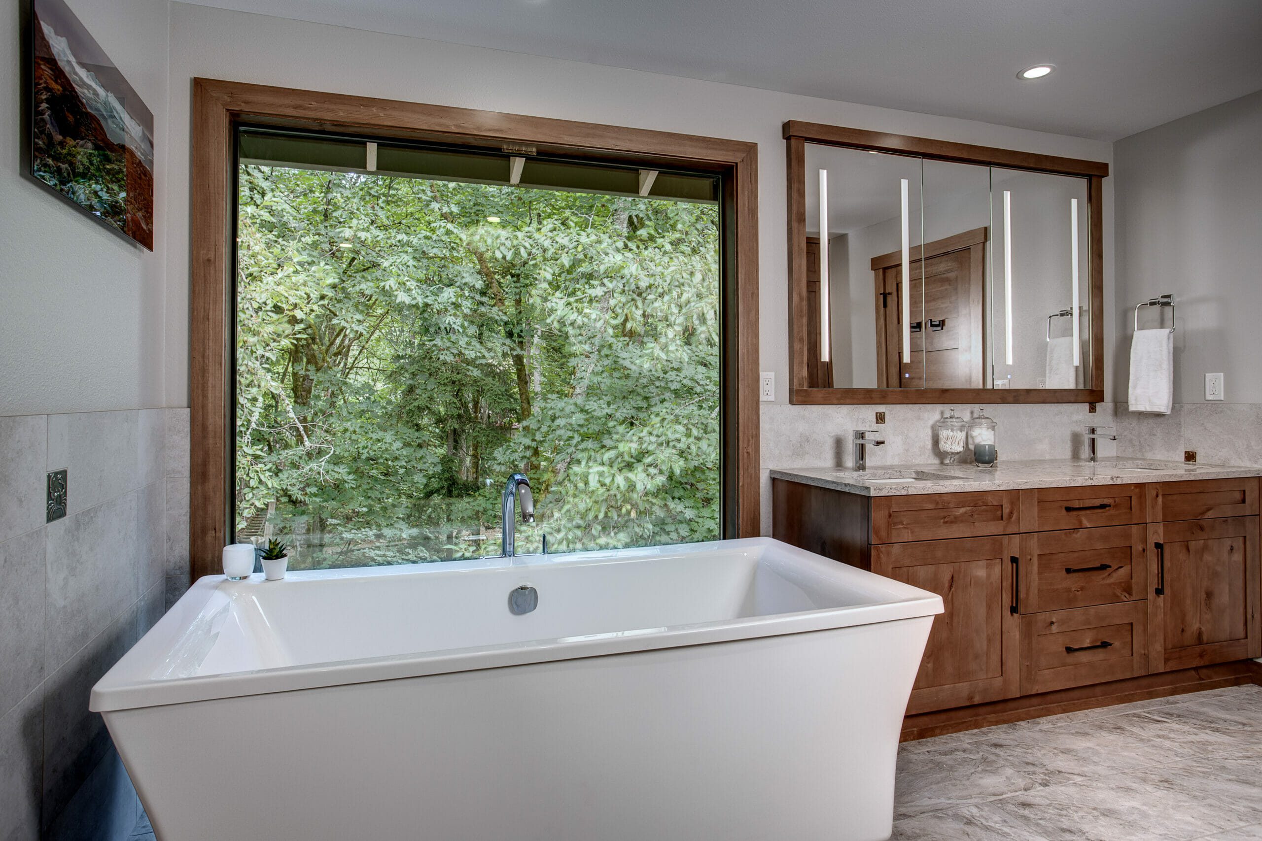
Tub for 2 With a View
- 2022 REX Award Winner – Bath Excellence
- Awarded by the Master Builders Association of King and Snohomish Counties
These nature lovers longed for a bathroom that would serve as a relaxing retreat to unwind and reconnect. The Nip Tuck team provided that and more with custom, animal-themed accent tiles and a deep soaking tub overlooking the incredible forested area just outside the picture window. Knotty alder cabinets and natural wood accents throughout bring a rustic, natural feel, and his & hers medicine cabinets with integrated LED lighting provide much-needed storage.
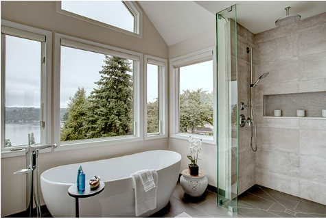
Lakeview Relaxation
- 2020 MBA REX Award – Bathroom Excellence
- 2020 NKBA Puget Sound – Honorary Best Before & After
The primary bathroom in this beautiful home was ready for an update — and a more accessible shower. We removed the curved walls and enclosed, cave-like shower in favor of a more spacious and open concept. The glass shower surround goes to the floor, with a zero-clearance entry and no door, making getting in and out of the shower easy. A floating vanity, LED mirrors, and joystick-controlled faucets further reinforce the contemporary elements of this home.

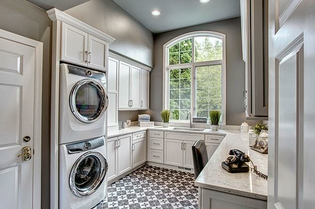
Dream Laundry
- 2020 MBA REX Award – Get Away Rooms
- 2020 NKBA 1st Place – Other Rooms
This newly-remodeled laundry room is more than just a workspace for taking care of clothes — it’s also a gift-wrapping station, and an actual desk space for our client. She wanted it to be light and playful and make a bold statement. A built-in desk at the entrance has a pull-out mouse pad and file drawers. Under-cabinet strip outlets provide lots of power and a clean backsplash. Quartz countertops with classy veining were used to complement the white cabinetry, and the patterned floor added just the right amount of fun the client was dreaming of. The beautiful statement window in the room ties the space together and is now fully visible from the entry.

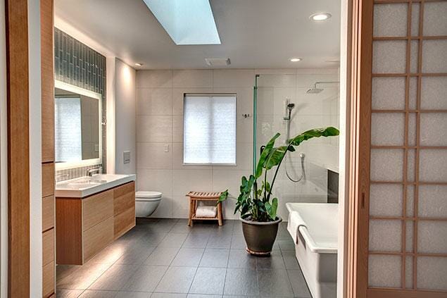
Modern Oasis
- 2020 NKBA Large Bath 2020 MBA Remodeling Excellence - Medium Bathroom
When we first met this couple, they had already demoed their primary bathroom but had become overwhelmed with the project. They hired us to transform their vision into a design-build dream. Custom fit cabinetry to coordinate with existing features in this contemporary home served as the perfect point of inspiration. Minimalist plumbing fixtures in a modern classic chrome finish balanced this bold casework. The tile and stone are high contrast, yet quiet enough to reinforce the modern aesthetic. Stunning custom shoji screens enclose all of this modern beauty.

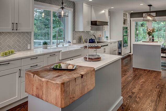
Heirloom Kitchen
- 2020 National Award, Chrysalis – 1st Place Kitchen $75,000 – $150,000
- 2020 MBA Remodeling Excellence - Large Kitchen
Nip Tuck Remodeling was awarded first place nationally for this kitchen remodel. We redesigned and enlarged the kitchen of this 1980s home by taking over the formal dining room and repurposing the unused formal living room into the new spacious dining room. The pièce-de-résistance was the creation of a permanent home for a family heirloom — a cobbler’s block from the 1800s that the homeowner had grown up with was incorporated into the kitchen island.


April Bettinger – Remodeler of the Year
- 2019 Master Builders Association – Remodeler of the Year
- 2020 MBAKS Remodeler’s Council – Member of the Year
April Bettinger founded Nip Tuck Remodeling in 2010, determined to create a construction company with extraordinary craftsmanship AND a focus on professionalism. She is driven to make a difference in the construction industry and leads her company with vision and purpose. It’s no wonder she and Nip Tuck Remodeling are consistently awarded for excellence!



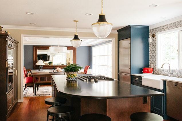
Let There Be Color
- 2019 NKBA - Large Kitchen
- 2019 MBA Remodeling Excellence - Medium Kitchen
The frustration of furnishing a formal dining room that nobody ever visits was at the heart of this remodel. We were asked to connect the kitchen and dining room and create an inviting and more casual space while maintaining the full functionality of the kitchen. Marrying special details with maximum storage and display space made for a fun, personalized space ready for a party! Opening the space also allowed the large decorative window in the dining room to spread natural light into the kitchen. Our client has already tested it several times and is happy to report that the new table is a great success!


2018 Class of Big 50
In 2018, Nip Tuck Remodeling was selected by REMODELING magazine to join the REMODELING Big50. Each year since 1986, the REMODELING Big50 inducts 50 remodeling companies demonstrating exceptionally high standards for professionalism and integrity through exemplary business practices, craftsmanship, and impact in their community or the industry. “To get a sense of how unique this status is, consider there are roughly 98,000 remodeling firms in America with paid staff,” noted Craig Webb, REMODELING’s Editor-in-Chief. “Since 1986, we have selected only about 1,600 firms. That’s just 1.6% of all the remodeling businesses in the country today.”
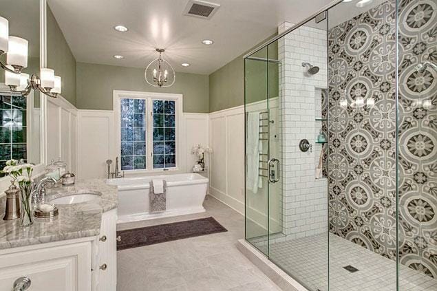
A Twist on a Classic Look
- 2018 Award Winner – 1st Place Large Bathroom NKBA Puget Sound Chapter
Once part of a Street of Dreams home, this primary bathroom was cloaked in granite, mirrors, and carpet. It was ready for an update.
Since the shower is visible from the hallway, the client wanted to turn it into a statement piece and simplify the rest of the bathroom to complement it. The shower became the focal point, with its dramatic patterned tile, double shower heads, and custom his/her niches. To help fit the budget, Nip Tuck upcycled the cabinetry with taller toe kicks, then added open shelving and a fresh coat of paint. We added a simple yet elegant board-and-batten detail around the tub and trimmed each mirror for further interest.

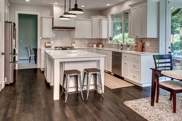
Something Old, Something New Again
- 2018 MBA Remodeling Excellence - Small Kitchen
We were called to give a very simple but impactful update to this Bothell, WA home. The existing kitchen was dark, and the range hood was a big trouble spot. While the overall layout of the kitchen was fine, the aesthetic was dated and not in line with our young client’s decor preference.
We painted all the kitchen cabinets in place with Benjamin Moore paint, refinished the existing hardwood floors with a rich, dark stain, replaced countertops with an updated white quartz, and installed subway tile for the backsplash.
The space was further modernized when we dismantled the existing range hood, shortened it by about eight inches, and dressed it up with a new flat-front door in rift oak stained to match the hardwood floor. We wrapped the fluted legs on the island for a clean, modern look and added new pendants.
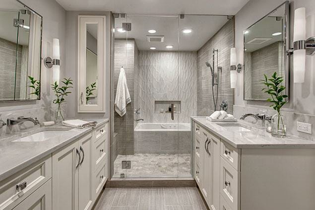
Sammamish Spa Retreat
- 2017 REX Award Winner — Bathroom Excellence $50,000 – $75,000 Awarded by the Master Builders Association of King and Snohomish Counties
- 2017 NKBA – Small / Medium Bath – 1st Place Awarded by the National Kitchen & Bath Association – Puget Sound Chapter
Our client had recently purchased this Sammamish rambler, and making significant changes to the primary suite was top on the list. Now, the primary bath exudes tranquility from the moment you enter the space. Creamy paint, a cozy heated floor, and a sculpted-tile feature wall greet you warmly, inviting you in. Every inch of the room has purpose and has been thoughtfully planned to meet our client’s wishes.

Sand Point Waterfront Whole Home Addition
- 2017 Chrysalis Regional - Specialty Spaces
- 2017 NKBA Honorary Award - Coolest Detail
Renovating a waterfront house is all about enhancing lifestyle and views, and this home is a perfect example of both. Built in 1937 and last renovated in 2004, the existing kitchen was tucked away in the center of the house, with its only window above the sink looking out at the neighbor’s home. Today, as we walk up to the entrance and through the front door we are welcomed by warmth, well-appointed spaces, and attention to detail in every nook and cranny.

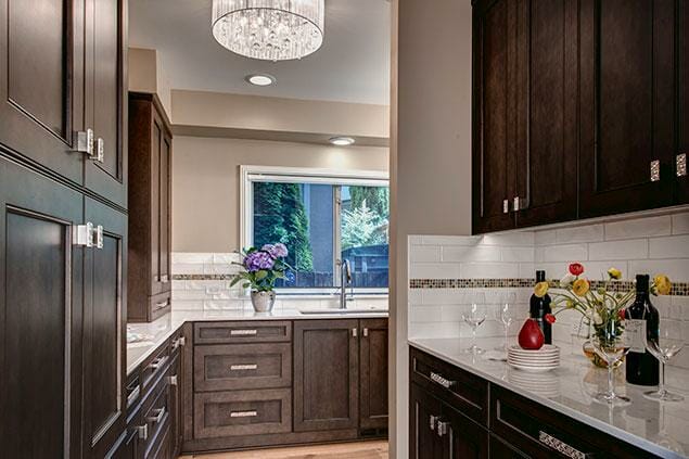
Walk-In Pantry – Sand Point Waterfront Addition
- 2017 NKBA – Other Room/Space – 2nd Place Awarded by the National Kitchen & Bath Association – Puget Sound Chapter
- 2017 Chrysalis Award Winner – Other Spaces National Award
Our goal was to honor this 1937 home with updated finishes while keeping as many original details as possible, both inside and out. In this remodel, we reconfigured the main floor, relocated the original kitchen into an addition, and created a walk-in pantry, ultimately creating a space worthy of entertaining.

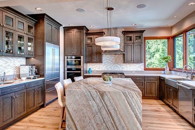
Sand Point Waterfront Addition – Kitchen Remodel
- 2017 – NKBA – Small / Medium Kitchen – 2nd Place
Waterfront living is all about the view, and this home had a kitchen tucked away in the middle of the house with a layout that was just not working. Our client wanted to maximize the view and have a space that truly worked for them.
We knocked most of the main floor down to the studs so we could customize every space to fit our client’s needs. The architecture of the home dates from the 30s, so maintaining the original feel of the house while bringing it up to date was a high priority.

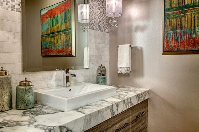
Powder Room – Traditional With a Twist
- 2017 NKBA – Powder Room – 2nd Place Awarded by the National Kitchen & Bath Association – Puget Sound Chapter
The designer’s primary challenge with this project was to honor the traditional theme of the home while incorporating the much more modern aesthetic requested by the homeowner. Now, the powder room is warm, modern, and reflects our client’s love of nature.

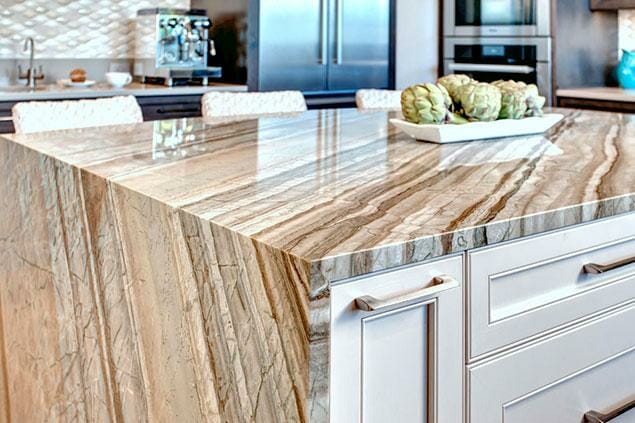
Kitchen Island – Coolest Detail
- 2016 REX Award Winner – Partial House / Addition $100,000 – $250,000 Awarded by the Master Builders Association of King and Snohomish Counties
- 2016 NKBA – Open Floor Plan Kitchen – 2nd Place Award Winner Awarded by the National Kitchen & Bath Association – Puget Sound Chapter
- 2016 Chrysalis Award Winner – Interior Remodel over $100,000 National Award
This quartzite waterfall island was awarded the Coolest Detail Award, a special award chosen by the judges at the National Kitchen & Bath Association. Thank you to our amazing fabricator, European Stone, for making this piece stand out.

Main Floor Remodel – Traditional With a Twist
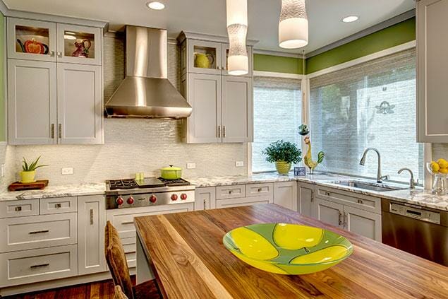
- 2016 NKBA – Small / Medium Kitchen – 2nd Place Awarded by the National Kitchen & Bath Association – Puget Sound Chapter
- 2016 REX Award Winner – Kitchen Excellence $90,000 – $140,000 Awarded by the Master Builders Association of King and Snohomish Counties
We were invited to remodel the main floor of this home with a revamp of the kitchen, family room, powder room, entry, and staircase. Our client requested a complete makeover that would bring in warm wood tones, light-painted cabinetry, and a modern aesthetic.
The kitchen boasts a beautiful Calacatta marble countertop around the perimeter, a walnut countertop on the island, and painted cabinetry with up, down, and interior lighting.


High Rise With a View – Kitchen Remodel
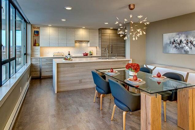
- 2016 REX Award Winner – Kitchen Excellence $90,000 – $140,000 Awarded by the Master Builders Association of King and Snohomish Counties
- 2016 NKBA – Medium Kitchen – 2nd Place Awarded by the National Kitchen & Bath Association – Puget Sound Chapter
Located on the 24th floor of a high rise in downtown Seattle, this stunning condo welcomes you with neutral tones, clean lines, and a modern aesthetic that complements the 180-degree view of the Seattle waterfront and the Space Needle.
The new kitchen has two-tone cabinets with a horizontal grain. The upper cabinets are purposely devoid of hardware, both as a design element, and as a solution to minimize the amount of metal used. The Liebherr refrigerator blends perfectly into the pantry situated next to it. As you look at the ceiling toward the exit to the hall, the designer found a creative and artful way to incorporate the last piece of dropped ceiling, which houses the venting for the range.


High Rise Condo Hall Bath Remodel
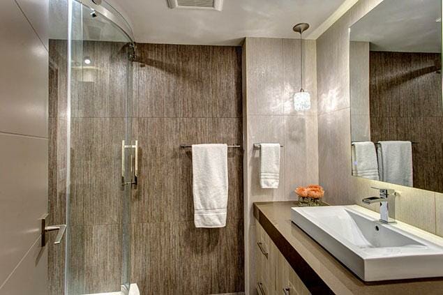
- 2016 NKBA — Small / Medium Bath – 2nd Place Awarded by the National Kitchen & Bath Association – Puget Sound Chapter
This small condo bathroom was brought to life with wall-to-wall tile, an LED-backlit mirror, and a custom radius shower.

Urban Entertainment Kitchen Remodel
- 2015 REX Awards – People’s Choice Award Awarded by the Master Builders Association of King and Snohomish Counties
- 2015 REX Award Winner – Kitchen Excellence less than $40,000 Awarded by the Master Builders Association of King and Snohomish Counties
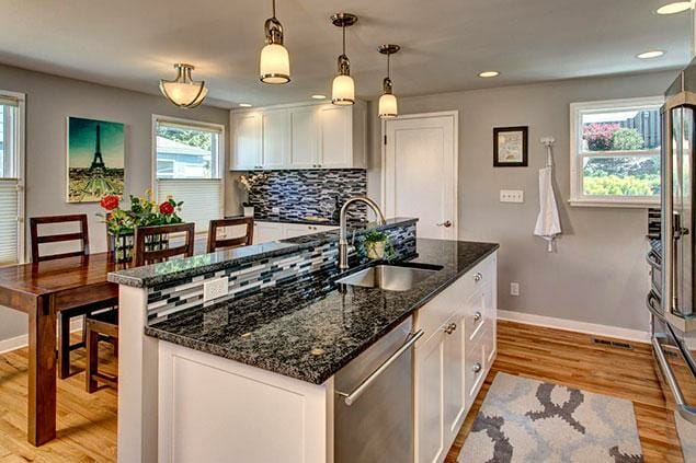
By removing a large pantry and utilizing the entire kitchen and eating space, we tripled the size of this kitchen from 64 square feet to almost 200 square feet. The combination of white painted cabinetry and black stone countertops is a simple, classic update. The stone and glass mosaic backsplash adds interest, creating a kitchen perfectly suited for this young urban couple. The project totally transformed this wonderful West Seattle home into a place that allowed the couple to do what they enjoyed most: preparing healthy meals together and spending time entertaining friends and family.

Modern Oasis – Master Bathroom Remodel
- 2015 REX Award Winner – Bath Excellence $30,000 – $50,000
- Awarded by the Master Builders Association of King and Snohomish Counties
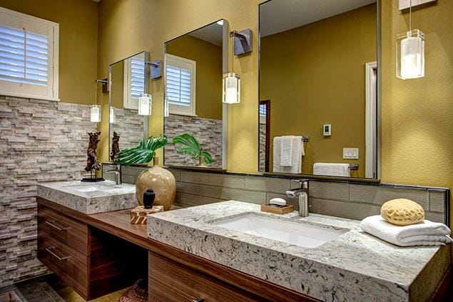
These homeowners originally only requested a new shower — but they quickly realized that what they really wanted was to create a luxurious, spa-like bathroom. Removing the partition wall to the shower room and eliminating the soaking tub made for a more open, serene space, and amenities such as under-cabinet lighting and a heated floor that runs into the shower create ambiance and comfort. The wall-mounted vanities with built-up stone sinks and the 3D stone feature wall bring in natural elements and complete the spa-like feel we sought to create.

Tiny Condo Kitchen Remodel
- 2012 REX Award Winner – Kitchen Excellence under $25,000 Awarded by the Master Builders Association of King and Snohomish Counties
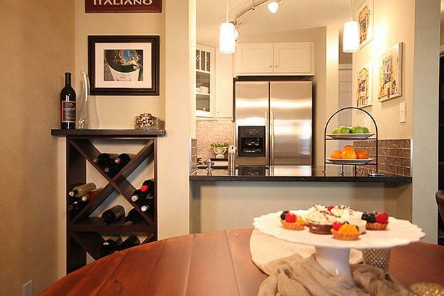
This was one of the very first kitchen renovations by Nip Tuck Remodeling! This compact kitchen embodies the personality and decor of our young, urban clients. It was thoughtfully designed to maximize the space and create a feeling of expansiveness. Though options for modifications were limited in this condo, simple changes, such as creating a level pass-through from the kitchen to the dining room and choosing a slide-in range with a flush-mounted top, increased the available work area and made the space feel much larger than it actually is. The combination of the black quartz, glass tile backsplash, and track lighting lend a classic, modern appeal to this Seattle condo.

Want to see more award winning design?
Check out our portfolio for a more in depth look of some of our recent (and award-wining) projects)

